4 Food-Inspired Summer Outfit Color Palettes to Try
Scroll through this summer's color inspiration and you'll notice something. Almost none of it comes from a paint swatch or a seasonal color chart. It comes from cherries. Watermelon. Powder-blue macarons. A beach umbrella caught mid-spin in the wind. That's not an accident; it's a styling trick that photographers and stylists have leaned on for years, and it works better than most formal color theory because it starts with something your eye already trusts.
Call it color scouting: instead of starting with a color wheel or memorizing which "season" you supposedly belong to, you pull your palette straight from the world around you, from the things you already find appetizing, calming, or striking. Food is one of the richest sources of this, because color in food isn't neutral. It's designed to be noticed. A ripe watermelon or a plate of macarons carries an intensity and warmth that a fabric swatch rarely matches.
Here's how four everyday color sources translate into four completely wearable summer outfits, and what each one reveals about building a palette that's genuinely yours.
• Cherry cream: Dusty pink, burgundy and white. Repeat the palette with a small polka dot or another scattered print.
• Watermelon red: Saturated red, tonal pink and white. Pair one solid item with a gradient, tie-dye or marbled print.
• Macaron blue: Powder blue, navy and gold. Use the darker shade to give the pale blue more structure.
• Umbrella stripe: Navy, white and cognac. Ground a graphic stripe with a warm neutral accessory.
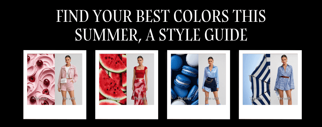
Cherries sitting in swirled pink cream give you a color that's warm without being loud; a dusty, slightly muted pink pulled straight from dessert rather than a paint chip labeled "blush." It's a pastel with weight to it, thanks to the deep burgundy of the cherries running through it.
The Outfit Translation
That same warmth shows up in a cropped polka-dot jacket and matching shorts set, styled with a plain white top and a structured white crossbody bag. The polka dot repeats the "cherries scattered across cream" composition almost exactly, so the outfit doesn't just borrow the color, it borrows the pattern too. That's the detail most people skip when copying a palette: it's not only about matching the hue, it's about matching how the color is distributed across the surface.
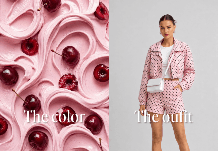
Watermelon red is deceptive. It reads as a bold, high-energy color, but because it shows up everywhere in summer, at fruit stands, on popsicle sticks, across a sunset, it actually functions like a neutral this time of year. Your eye is primed to accept it as familiar rather than shocking.
The Outfit Translation
The outfit pulls the exact contrast from the fruit itself: a solid, saturated red crop top for the flesh, paired with a tie-dye maxi skirt with a thigh-high slit that mirrors the marbled pink-and-white rind. A color palette doesn't have to be flat to work. Watermelon isn't one red, it's three or four reds and pinks layered together, and the tie-dye skirt captures that gradient instead of flattening it into a single block of color.
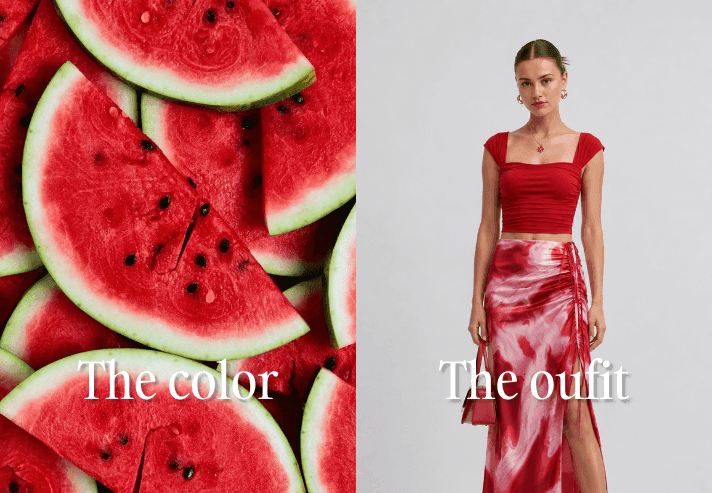
Blue macarons stacked together give you a color that's easy to underestimate: a chalky, powdery blue that looks flat in isolation but turns out to be one of the most flattering shades for warm summer light. It photographs well because it's soft enough not to compete with skin tone, yet saturated enough to still register as an intentional choice.
The Outfit Translation
A satin blue button-down, tucked into a navy mini skirt with a gold chain belt and finished with knee-high blue boots, takes that softness and adds structure. The navy skirt and chain belt keep the look from feeling too sweet, the same way the darker macaron shells stacked among the paler ones keep the whole plate from reading as one-note. Color scouting works best when you notice the darkest and lightest values in your reference, not just the dominant one.
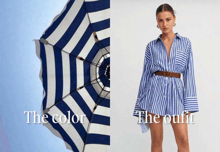
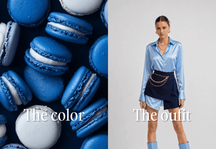
A striped beach umbrella against a clear sky isn't just a color reference, it's a pattern reference. The navy and white stripe is graphic, high-contrast, and instantly recognizable as "summer" before you even register it as a color story.
The Outfit Translation
The outfit takes that print almost literally: an oversized navy-and-white striped shirt dress, cinched at the waist with a cognac leather belt. The belt is the detail worth noticing. Warm brown against cool navy and white keeps the outfit from feeling like a costume; it grounds a very graphic print with a neutral that has nothing to do with the beach at all. Small trick, big payoff: when you borrow a bold pattern from a color source, add one neutral that isn't part of the original reference to keep it wearable.
Traditional color analysis sorts people into a handful of fixed categories: warm autumn, cool winter, soft summer, and so on. It's useful as a starting point, but it also treats color as something that exists in isolation, one swatch, one verdict. Real color inspiration rarely works that way. A cherry isn't one red, it's cream, burgundy, and near-black all in the same bite. A macaron shell shifts from pale sky to deep navy across four cookies sitting next to each other.
Sourcing your palette from something you already respond to, a food, a piece of art, a place, captures that range in a way a single swatch never can. You end up with a family of related tones instead of one isolated color, which is closer to how outfits actually get built: a dominant shade, a deeper accent, and a lighter highlight.
The One Thing Color Scouting Can't Tell You
Here's the honest caveat. Loving a color and looking good in it aren't always the same thing. Watermelon red might be the most appetizing color of the summer, but if your undertone pulls cooler, that exact red can look slightly off against your skin even while it looks perfect on a plate.
This is where color scouting and personal color analysis need to work together, not compete. Scouting tells you what draws your eye. Understanding your own undertone tells you which version of that color, warmer, cooler, deeper, or softer, will actually work for you specifically.
This is exactly where BeSpoke AI Stylist fits in, not to replace your instinct for color, but to tell you which version of it belongs in your closet.
Color Report
Upload a photo and get a breakdown of your undertone and the color families that genuinely suit you. Before you commit to watermelon red or macaron blue, Color Report tells you whether to shop the exact shade in the reference image or shift a few degrees warmer or cooler to get the same effect on you.
Digital Closet
Once you know your palette, upload what you already own and see it organized in one place, so you can spot the gaps, a chain-belt skirt, a striped shirt dress, instead of buying pieces you already have a version of.
Virtual Try-On
Before committing to a bold print like the umbrella stripe or a saturated shade like watermelon red, Virtual Try-On lets you preview it on yourself first, so you're working from what you'll actually see in the mirror, not just what looked good on a model.
Outfit Planner and Canvas
Outfit Planner helps map your new colors into outfits you'll actually wear during the week, while Canvas gives you a moodboard space to keep pulling references, whether that's your next fruit stand or your next fashion week recap.
The color scouting is the fun part. Making sure it actually works on you is what these tools are for.
Is color scouting the same as seasonal color analysis?
Not exactly. Seasonal color analysis sorts you into a fixed category based on your undertone. Color scouting is a way of finding inspiration, pulling palettes from things you're already drawn to. The two work best together: scout for inspiration, then check it against your undertone before you shop.
What if the color I love doesn't suit my skin tone?
It usually doesn't mean skipping the color entirely. It often just means adjusting the exact shade; a slightly warmer or cooler version of the same red or blue can make a big difference. That's where a tool like Color Report becomes useful.
Do I need to match the outfit exactly to the color source?
No, and you shouldn't try to. The goal is to capture the range of tones in the reference, the lightest, darkest, and dominant shades, not to find a single item that matches one swatch exactly.
Where else can I find color inspiration besides food?
Anywhere you already respond to color: architecture, travel photos, plants, even packaging design. Food just tends to be an especially fast source because color in food is designed to grab attention immediately.
The best summer color palette was never going to come from a swatch card. It was always going to come from the things that already catch your eye: the fruit stand you walk past, the dessert case you linger at, the umbrella you photograph without really thinking about why. The next step is just making sure the version you wear is calibrated to you, not just to what looked good on a plate. Discover your best colors and build the perfect outfit with BeSpoke AI Stylist.
Sources and Further Reading
- International Commission on Illumination (CIE): Perceived Colour
- David I. Perrett and Reiner Sprengelmeyer: Clothing Aesthetics: Consistent Colour Choices to Match Fair and Tanned Skin Tones (i-Perception, 2021)
- Hye Rim Hong and Young In Kim: A Mobile Application for Personal Colour Analysis (Cogent Business & Management, 2019)
By the BeSpoke AI Stylist Editorial Team
Published: 14/08/2026
Last updated: 14/08/2026
Ready to upgrade your style game? Download BeSpoke AI Stylist and let your AI stylist take it from here.

Author
Neeraj Bansal