Color Combinations That Actually Work: The Complete Guide | BeSpoke AI Stylist
Published · Updated
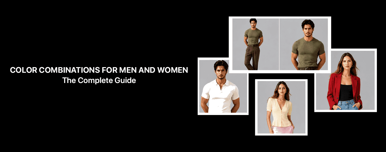
Color Combinations That Actually Work: The Complete Guide
By the BeSpoke AI Stylist Editorial Team
Getting dressed should feel easy, not like solving a puzzle every morning. The difference between an outfit that looks pulled together and one that feels slightly off almost always comes down to one thing: color.
You don't need a color theory degree to get this right. You need a small set of combinations you can return to again and again, then apply to whatever's already in your closet.
Why Color Does More Work Than People Think
Color is the first thing anyone registers about an outfit, before they notice the cut, the fabric, or the brand. A well-paired palette signals that thought went into getting dressed. A clashing or overly matched one reads as either chaotic or try-hard, no matter how expensive the individual pieces were.
This is also the real secret behind outfits that "look expensive." It's rarely about the price tag. A well-cut, affordable piece worn in a considered color pairing will read as more intentional than an expensive item paired badly. The logic behind quiet luxury dressing, tonal depth, restraint, deliberate contrast, is available to anyone, at any budget.
The Combinations Worth Actually Learning
Navy and camel. The most reliable neutral pairing that exists. Warm and cool balance each other, and both colors work across almost every category, from tailoring to casualwear.
Black and white. The highest-contrast classic pairing. Sharp, clean, and nearly impossible to get wrong if the proportions are right.
Olive and rust. An earthy, warm combination that reads as considered rather than accidental. Works especially well for warmer undertones.
Grey and burgundy. A cooler, more formal pairing with just enough contrast to avoid looking flat. Reliable for both work and evening.
Sage green and dusty pink. A softer, muted combination that leans gentle rather than bold, ideal for lighter, cooler undertones.
Monochrome tonal dressing. Staying within one color family, but varying the shade and texture (a deep chocolate brown top with a lighter tan bottom, for example) creates depth without needing a second color at all.
The Mistake Most People Make With Color
Treating color pairing as exact shade-matching. Buying a top and bottom in what's meant to be "the same" navy, only to find the tones don't quite align, flattens an outfit and removes the visual depth that makes a look feel expensive.
The combinations above work because they use tonal variation or deliberate contrast, not identical matching. That's the actual difference between a costume-like outfit and a considered one.
How to Apply This to a Wardrobe You Already Own
Identify your existing neutrals. Most closets already have navy, black, grey, camel, or olive somewhere in them. Start there.
Add one accent color per combination, rather than trying to work three or four colors into a single outfit.
Use color near the face for the biggest visual impact. A top, scarf, or collar in a flattering shade lifts the whole outfit more than the same color used lower down.
Check prints against this same logic. A patterned piece still has a dominant color, treat it the same way you'd treat a solid.
Color Combinations for Men vs. Women: What Actually Differs
The underlying logic is identical for everyone, contrast, tonal balance, and restraint. What differs is mostly proportion and category. Men's tailoring tends to lean on fewer, higher-contrast pairings (navy and white, grey and burgundy), while womenswear has more room to play with softer tonal combinations across dresses, layering pieces, and accessories. Neither is a fixed rule, just a starting point.
Frequently Asked Questions
What's the safest color combination if I'm not confident with color?
Navy and camel or black and white. Both are nearly foolproof and work across almost any occasion.
Do these combinations work for patterns, not just solid colors?
Yes. Identify the dominant color in a print and pair it the same way you would a solid piece.
Is there a difference between "matching" and "coordinating" colors?
Yes, and it matters. Matching means identical shades, which often looks flat. Coordinating means using tonal variation or deliberate contrast, which is what actually reads as put-together.
Can an app help me find these combinations in my own closet?
Yes. Once your wardrobe is digitized, a tool like BeSpoke AI Stylist's Designer feature can test color pairings against your own pieces before you commit to an outfit.
Want to see these combinations applied to your own wardrobe instead of a stock photo? Try the Designer feature inside BeSpoke AI Stylist. Download on the App Store or Play Store.
Ready to upgrade your style game? Download BeSpoke AI Stylist and let your AI stylist take it from here.

Author
Neeraj Bansal