The Autumn Colour Edit: 6 Colour Pairings to Wear This Season
Published · Updated
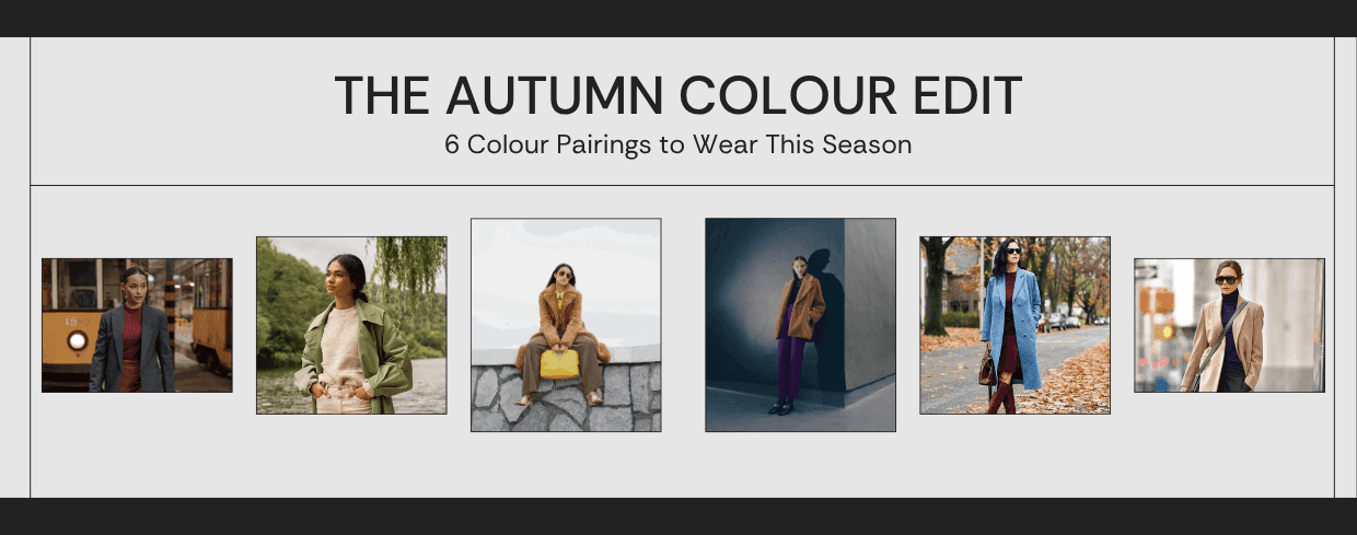
Autumn colour dressing often gets reduced to a few expected shades. In practice, the season has more room than that. What matters is the relationship between colours and the mood they create together.
This edit looks at six pairings that feel grounded, useful and easy to picture in real outfits. Some are soft. Some have more contrast. All of them offer a clear direction when you want your autumn wardrobe to feel cohesive.
At a Glance
- Chocolate and butter feel warm and polished.
- Olive and oat keep the palette soft and grounded.
- Plum and camel bring depth without heaviness.
- Burgundy and powder blue balance richness with lightness.
- Charcoal and rust feel sharp but still seasonal.
- Navy and hazel offer a quieter way into autumn colour.
Chocolate and Butter
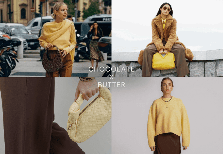
Chocolate has depth, while butter brings light and softness. Together they feel rich without becoming too dark. This pairing works especially well when you want warmth without relying on black.
Styling note: Use butter near the face and let chocolate ground the outfit. Try a butter-yellow jumper with a chocolate skirt. Explore mixing textures in an outfit while keeping those colours
Olive and Oat
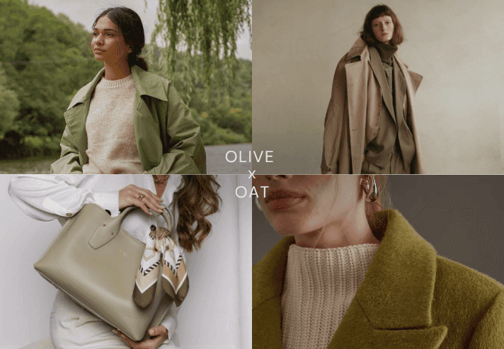
Olive can sometimes feel strong on its own. Oat softens it and makes the pairing feel more approachable. The result is calm and easy to wear.
Styling note: This is a useful pairing for outerwear, knitwear and soft layering pieces.
Plum and Camel
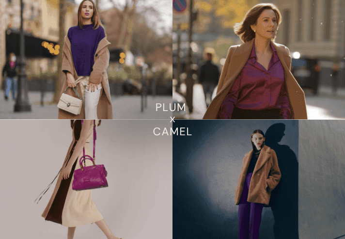
Plum adds a little drama, while camel keeps the outfit settled. The contrast feels elegant rather than loud.
Styling note: Try plum as the accent and let camel carry the larger surfaces.
Burgundy and Powder Blue
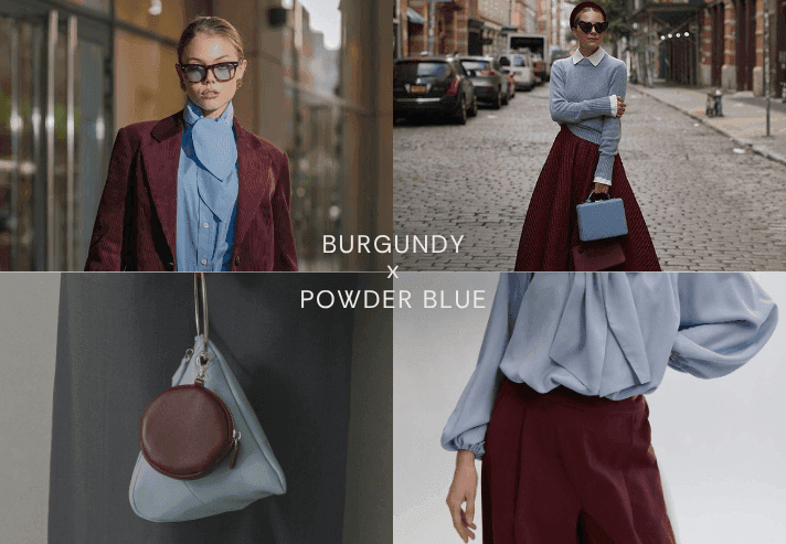
This pairing works because one colour is deep and one is airy. Burgundy keeps the look grounded, while powder blue lifts it.
Styling note: A shirt, knit or accessory in powder blue can shift a burgundy outfit beautifully.
Charcoal and Rust
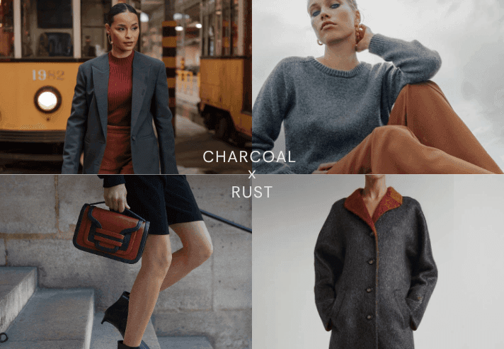
Charcoal gives structure. Rust brings warmth. The mix feels current and a little sharper than the softer combinations.
Styling note: This is a strong option when you want autumn colours that still feel clean.
Navy and Hazel
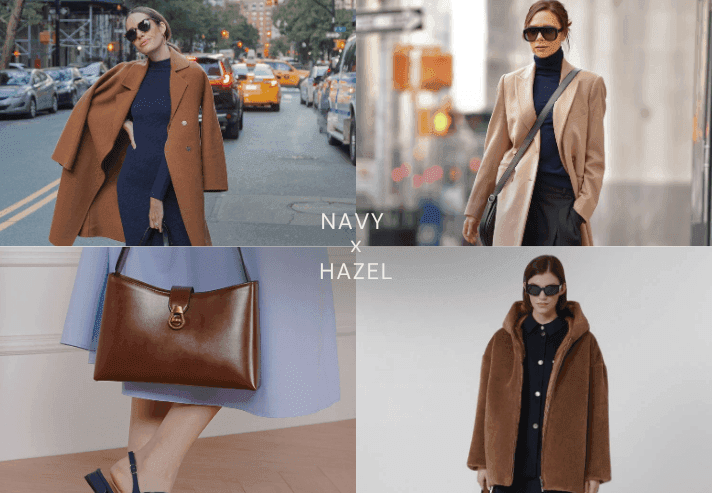
Navy is familiar, which makes it a good base. Hazel adds an earthy warmth without overpowering the look.
Styling note: Use hazel in coats, bags or shoes when you want a subtle seasonal change. Try a navy dress with hazel loafers. Compare other ways of styling flats with dresses before choosing the pair you prefer.
How to Use an Autumn Colour Edit in Real Life
You do not need to wear a pairing head to toe for it to count. A colour relationship can come through a bag, a knit, a trouser, or a small layer. The aim is not to follow a formula rigidly. It is to give yourself a reliable starting point.
- Begin with one familiar base shade.
- Add the second colour where you want the eye to go.
- Repeat the pairing a few times so it starts to feel natural.
Frequently Asked Questions
What colours work best in autumn?
That depends on your wardrobe and taste, but deeper earthy tones and softened light shades often sit well together in autumn dressing.
How do I wear autumn colours without looking too dark?
Pair deeper shades with lighter ones such as butter, oat or powder blue to keep the outfit open.
Do I need to buy a full new palette for autumn?
No. Start with one pairing and work it into the pieces you already own.
Sources and Further Reading
Ready to upgrade your style game? Download BeSpoke AI Stylist and let your AI stylist take it from here.

Author
Neeraj Bansal